If you’ve ever looked at a finished colored pencils art piece and thought, “Wow, how do they make the colors pop like that?”—you’re not alone. Whether you’re an avid hobbyist with a dozen coloring books under your belt or someone just diving into this relaxing pastime, getting vibrant, eye-catching results doesn’t have to be complicated.
Many people assume that stunning colored pencil work requires complex blending or a drawer full of expensive tools. But that’s far from the truth. With just a handful of simple techniques and a good set of colored pencils, you can transform your coloring pages into artwork that feels alive with color—no blending required.
In this guide, we’ll walk through powerful, easy-to-learn techniques that will elevate your art and make your coloring time more enjoyable and rewarding.
Choosing Good Colored Pencils: It Matters More Than You Think
Let’s start with your tools. You don’t need the most elite artist’s set to create something beautiful, but you do need pencils that offer rich pigment and smooth application.
Cheap pencils often result in streaky lines or waxy finishes that dull the vibrancy of your colors. Look for brands known for deep color saturation and softness that allows for layering—qualities you’ll find in brands like Prismacolor, Faber-Castell, or even high-quality budget options like Arteza or Crayola’s premium lines.
To test if your pencils are up to the task, try coloring a circle with medium pressure. Does the color appear bold and even? Can you layer another color on top without scratching the paper? If the answer is yes, you’re set.
Layering with Purpose: Build Color Like a Story
Layering isn’t just about putting one color over another—it’s about intention. Think of it like storytelling. Your first layer sets the scene, the next layer adds depth, and every layer after that brings the characters to life.
Start with light pressure and add color gradually. For example, if you’re coloring a forest scene, lay down a base of light green. Then go over parts of it with olive or yellow-green to add dimension. Finally, apply a dark green or brown in areas where shadows would naturally fall.
This approach allows you to control intensity and makes your final image look dynamic instead of flat.
Crosshatching: A Creative Alternative to Blending
Many tutorials focus heavily on blending, but crosshatching is an underrated superstar in the world of colored pencils art.
Crosshatching involves drawing sets of parallel lines in different directions. This technique can be used to create texture, shading, and even gradients—without the need to smudge or blur your colors.
Use it to:
- Add depth to a sky without making it look too uniform.
- Create texture in animal fur, tree bark, or fabric.
- Suggest shadows in clothing or flower petals.
It adds an expressive, artistic feel to your coloring and looks especially impressive when done with good colored pencils that have strong pigmentation.
Use Paper to Your Advantage For Colored Pencils Art
Not all paper is created equal. The kind of surface you color on can make a huge difference in how your pencils behave. Standard printer paper? Too smooth, and it won’t grip the pigment properly. On the other hand, textured paper—like what you’ll find in high-quality coloring books or printable coloring pages designed for artists—lets the pigment settle into the grain. This helps your colors look more saturated and stay in place.
When using printable coloring pages, make sure to print on cardstock or heavyweight matte paper (try 80–110 lb). It gives your pencils something to hold onto and allows you to apply multiple layers without damaging the page.
Playing with Pressure: Your Secret Weapon
Ever wonder why some colored pencil art looks like it’s glowing? It’s often a result of controlled pressure.
By adjusting how hard you press on your pencil, you can create light, whispery strokes or bold, intense bursts of color. Here’s how to use this technique effectively:
- Light Pressure: Use this for base coats and background areas.
- Medium Pressure: Ideal for layering and midtones.
- Heavy Pressure: Reserve this for highlights, focal points, or the final coat to make areas stand out.
Try it out by coloring a single leaf on your page three times—each with different pressure. The result? One leaf will feel dreamy and soft, another grounded and earthy, and the third bright and punchy.
This simple change in hand pressure gives you a huge range of expression without any fancy tools.
Color Theory in Action: Think Like a Painter
If you want your colored pencils art to go from “nice” to “WOW,” it’s time to start thinking in color relationships.
Instead of choosing colors randomly, try using color theory as your guide. Complementary colors (like blue and orange or red and green) can create stunning contrast when placed side by side. Analogous colors (such as yellow, orange, and red) offer a harmonious look that’s easy on the eyes.
Use contrasting tones to draw the viewer’s attention to a focal point on the page. For instance, in a garden scene, using purple flowers against a yellow-green background will make them pop off the page.
Once you start using color placement with intention, your coloring pages will take on a more professional, cohesive appearance.
Add Texture Without Blending With Colored Pencils Art
Looking for a fun way to make your art more interesting? Try these texture techniques:
- Stippling: Tap your pencil lightly in one area to create dots. Great for flower centers, pebbles, or animal fur.
- Scumbling: Use small, tight circular motions to mimic soft textures like clouds or wool.
- Directional Strokes: Let your pencil follow the natural direction of the subject—flowing lines for hair, upward lines for grass, and swirls for water.
These techniques let your creativity shine and offer beautiful results without ever blending a single color.
The Power of White Space
Don’t feel like you have to color every inch of the page. Strategic white space can add contrast, depth, and even realism.
In nature scenes, white space can suggest sunlight glinting on water or light shining through a canopy of leaves. In abstract pages, it adds modern flair and sophistication.
Try leaving slivers of the page uncolored—on purpose—and watch how it changes the energy of your work.
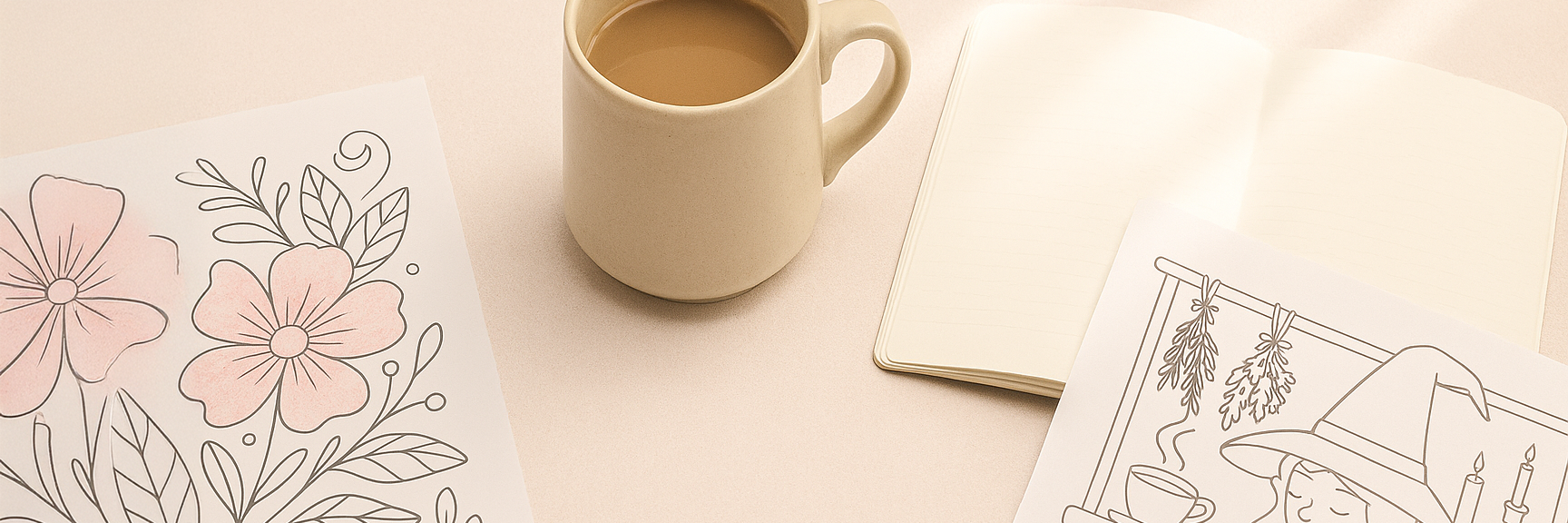
Your Coloring Pages Deserve to Shine
Whether you’re working on intricate mandalas or whimsical floral scenes, the techniques you use should help you enjoy the process—not overcomplicate it. That’s why choosing quality coloring pages makes such a difference.
Printable coloring pages designed for hobbyists often come with cleaner lines, balanced detail, and room for artistic interpretation. These pages invite experimentation and are ideal for practicing all the techniques we’ve covered.
Ready to Try These Techniques?
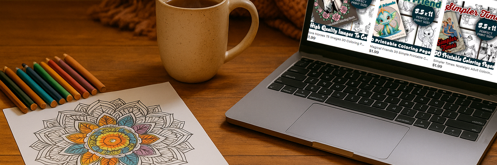
You don’t need to master every technique overnight. Just try one new idea the next time you pick up your pencils and see how it feels. With each page, you’ll gain confidence—and soon you’ll be creating vibrant, expressive colored pencils art that turns heads. Want beautiful, high-quality printable coloring pages that pair perfectly with your colored pencil skills? Download your free set here and start your next masterpiece today.