Accurately rendering skin tones can be one of the most challenging aspects of coloring, especially for beginner and intermediate colorists. In this guide to color theory skin tone in coloring, we will delve into techniques and tips to help you achieve natural, vibrant skin tones using colored pencils. With the right approach, you can avoid common issues such as flat or washed-out colors and bring your characters and portraits to life with realistic depth and warmth.
Understanding Color Theory for Skin Tones
Achieving accurate skin tones starts with a solid understanding of color theory. Skin is not just one uniform color; it consists of a spectrum of hues influenced by underlying pigments, lighting, and shadows. In the context of color theory, skin tone requires knowing how to mix and layer colors. The key is to work with a base of warm or neutral tones and gradually build up layers of highlights and shadows.
Artists often start with a mid-tone that reflects the natural color of the skin and then add warmer or cooler tones to indicate areas of light and shadow. This approach prevents the skin from appearing flat, ensuring that the finished artwork has depth and realism. When you combine these techniques with quality colored pencils that offer smooth blending capabilities, you can create skin tones that feel lifelike and full of character.
Common Challenges in Achieving Natural Skin Tones
Many colorists face several hurdles when trying to render realistic skin tones. One of the main issues is avoiding flat or washed-out results. This can happen when the chosen colors lack vibrancy or when the blending technique fails to create smooth transitions. For beginners, it is common to overuse a single color or to layer too heavily, which can lead to a monotonous appearance.
Another challenge is the tendency for skin to appear either too warm or too cool. The natural variation in skin requires a balance between warm tones (such as reds, oranges, and yellows) and cool tones (such as blues and greens) to achieve a harmonious look. Incorrectly balanced hues can result in skin that looks either overly red or dull and lifeless.
To combat these issues, it’s crucial to experiment with different color combinations and practice layering techniques that enhance the natural gradient of skin. Utilizing a mix of complementary colors can provide the necessary contrast and depth, while gradual application ensures that no single area becomes too dominant.
Tools and Materials for Perfecting Skin Tones
Selecting the right colored pencils is an important step in achieving accurate skin tones. High-quality pencils with soft cores tend to blend more smoothly, which is essential for creating subtle transitions. When it comes to color theory, skin tone uses pencils that offer a rich pigment concentration and can provide the depth needed to emulate the variations found in real skin.
Invest in pencils that are specifically designed for blending. Quality pencils not only allow for smoother transitions but also maintain the intensity of the colors over multiple layers. Additionally, consider using blending tools such as colorless blenders or even a white pencil to help merge layers seamlessly without diluting the color’s saturation.
The paper you choose also plays a significant role in the outcome of your work. A paper that is smooth yet has enough texture to hold the pigment will help you achieve a natural finish. Experimenting with different types of paper can reveal which one works best for your style and preferred blending technique.
Techniques for Avoiding Flat or Washed-Out Skin Tones
The key to vibrant skin tones lies in effective layering and blending. Begin with a base color that represents the mid-tone of the skin. Once you have your base established, gradually build up additional layers to define shadows and highlights. The process should be gradual, applying light layers to avoid over-saturating the paper.
One effective method is to work from light to dark. Start with a light touch and add darker shades to create depth in areas like the cheeks, around the eyes, and under the chin. By carefully blending these layers, you can create a smooth transition that avoids harsh lines and maintains the natural flow of the skin.
Avoid the temptation to use a single stroke for large areas. Instead, use multiple, overlapping strokes to ensure even coverage and a natural gradation of color. This technique not only enhances the vibrancy of the skin tone but also prevents the final result from looking too uniform or flat.
Understanding the Role of Light and Shadow
Light and shadow are integral components in creating realistic skin tones. They not only add dimension but also contribute to the overall mood of the piece. When working with color theory skin tone needs to identify the source of light in your artwork. This determines where the highlights will naturally occur and where the shadows will deepen the color.
Incorporate both warm and cool tones to represent the interplay of light. For example, a face illuminated by soft, warm light might display subtle hints of gold and peach, while the shaded areas could incorporate cooler tones to suggest receding features. This interplay is what gives the skin its dynamic quality and prevents it from looking flat.
Taking the time to study portraits—whether from real life or master artworks—can offer valuable insights into how light interacts with skin. Use these observations as a guide when applying colors with your pencils. Balancing the warm and cool elements correctly will make a significant difference in the final outcome of your piece.
Incorporating Color Theory Skin Tone into Your Overall Palette
Creating realistic skin tones is just one component of a successful artwork. The skin tone should harmonize with the overall color palette of the piece. This means that the colors used in clothing, background elements, and accessories should complement the skin tone rather than clash with it.
A well-rounded approach to color theory skin tone involves considering the entire composition. Use complementary colors to accentuate features and create balance. For instance, if your subject’s skin tone has a warm base, integrating cooler hues in the background can make the subject stand out more dramatically.
It’s also important to continuously test and adjust your color mixtures. This trial-and-error process is an essential part of developing an intuitive sense for color harmony. Experimentation with different ratios and blending techniques can lead to unique and beautiful results that set your artwork apart.
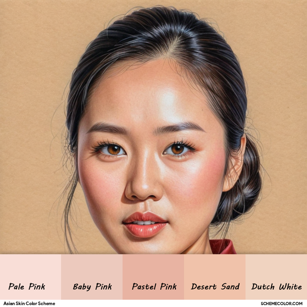


Color swatches from Scheme Color
Common Mistakes and How to Avoid Them
Even the most seasoned artists can struggle with getting skin tones right. One common mistake is overblending, which can result in a muddy or indistinct appearance. Instead of aiming for complete uniformity, allow for slight variations in tone that mimic the natural imperfection of human skin.
Another error is using too many layers without allowing sufficient drying or setting time between applications. This can lead to colors mixing in unintended ways, making the skin look washed out. Patience and a gradual approach to building up layers are key.
Finally, inadequate blending tools or low-quality colored pencils can hinder your efforts. Investing in good materials and taking the time to practice your technique will ultimately pay off. Remember that each project is a learning experience, and refining your approach to color theory skin tone in coloring is an ongoing journey.
Maintaining Consistency Across Your Artwork
Achieving a consistent skin tone throughout your artwork requires careful attention to detail. Even slight variations in the application of colored pencils can result in noticeable discrepancies. It is crucial to maintain a consistent method when layering colors, ensuring that your techniques remain uniform across the piece.
Documenting your process can be beneficial. Consider keeping a visual diary or a reference sheet of your favorite color mixes for skin tones. This not only helps in reproducing the same effect in future projects but also serves as a personalized guide to your own artistic style. Consistency in your work builds confidence and results in a polished final piece.
Embracing Experimentation and Continuous Improvement
While this guide to applying color theory skin tone in coloring provides a structured approach, creativity is inherently experimental. Don’t be afraid to deviate from traditional methods and try new combinations. Sometimes, unexpected results can lead to innovative techniques and stunning outcomes.
Every artist evolves over time. Use each project as an opportunity to refine your understanding of color interactions and to perfect your blending technique. With practice, you’ll develop an intuitive grasp of how to manipulate colors to achieve the desired effect. The key is to keep experimenting and improving with every stroke of the pencil.
Enhance Your Art with Mastery of Color Theory Skin Tone
Achieving natural, accurate skin tones is a critical component of producing compelling artwork. By understanding the fundamentals of color theory skin tone in coloring, addressing common issues such as flat or washed-out results, and utilizing proper tools and techniques, you can create pieces that truly come to life.
Whether you are just starting out or have been coloring for years, refining your approach to skin tones will elevate the overall quality of your work. Every layer and blend contributes to a richer, more dynamic portrayal of your subject, making your art not only visually appealing but also emotionally engaging.
If you’re ready to take your art to the next level and see smoother, more natural skin tones in your work, consider signing up for our free printable coloring pages to get ongoing tips and inspiration.