When it comes to coloring, choosing the right colors can make all the difference. Whether you’re working on intricate designs, beautiful landscapes, or whimsical patterns, the way you pair colors can elevate your artwork to a whole new level. One of the most powerful tools in color theory is understanding complementary colors—colors that sit opposite each other on the color wheel and create striking contrasts when used together. In this article, we’ll explore the concept of complementary colors, with a particular focus on complementary colors to blue. Whether you’re an experienced colorist or just starting, this guide will help you understand how to harness the power of color pairings and how they can take your coloring book artwork to new heights.
What Are Complementary Colors?
Complementary colors are pairs of colors that are located opposite each other on the color wheel. When used together, they create high contrast and make each other appear more vibrant. Complementary color schemes are a staple in art and design because they draw attention and balance each other out.
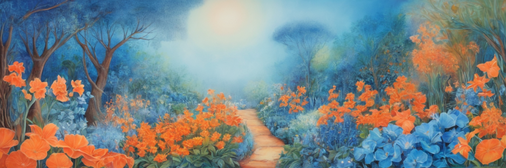
For example, blue’s complementary color is orange. These two colors are opposites on the color wheel, meaning they create a strong contrast when paired together. But it’s not just about finding the perfect opposite color; it’s also about understanding how these colors interact in various contexts, from creating depth to evoking specific moods.
Blue and Its Complementary Color: A Powerful Pairing
Blue is a calm, soothing color that represents trust, tranquility, and wisdom. It’s a popular choice for many colorists, especially for those creating relaxing scenes like oceans, skies, and serene landscapes. But when blue is paired with its complementary color—orange—it transforms.
Orange, with its warm, energetic undertones, contrasts beautifully with blue’s coolness. The combination of these two colors brings balance and excitement to artwork. When you combine them in your coloring book pages, you create a dynamic, attention-grabbing result that pops off the page.
Variations of Blue and Orange
While blue and orange are complementary, there are many shades of each that can affect the outcome of your artwork. Lighter blues, such as sky blue or baby blue, pair well with softer oranges, like peach or apricot, to create a gentle contrast. On the other hand, dark blues, such as navy or midnight blue, work beautifully with bold oranges, such as tangerine or pumpkin, for a striking and dramatic effect.
Understanding the different shades and tones of blue and orange will allow you to choose the right balance for your specific project. Whether you’re coloring a peaceful scene or an energetic abstract piece, this knowledge can help you decide how to balance the cool and warm tones for the best visual impact.
How Complementary Colors to Blue Affect Mood and Emotion
Color has the power to influence mood and emotions, and the pairing of complementary colors can amplify this effect. Blue is often associated with calmness, relaxation, and stability, while orange tends to evoke warmth, energy, and enthusiasm.
When used together, these colors can create a balance between serenity and excitement, making your artwork feel both grounded and vibrant. For example, if you’re coloring a landscape with a blue sky and an orange sunset, the combination of the two will evoke both a sense of peace and the dynamic energy of the setting sun.
Additionally, complementary color schemes are often used in design and art to highlight specific focal points or areas of importance. If you want to draw attention to a particular object in your coloring book page, using blue and orange can guide the viewer’s eye directly to that element, creating emphasis and depth.
The Science Behind Complementary Colors
Complementary colors are not just a visual aesthetic—they’re backed by color theory and psychological studies. When two complementary colors are placed side by side, they appear more intense and vibrant. This phenomenon, known as simultaneous contrast, occurs because our brains interpret the colors relative to each other.
This visual impact is why complementary colors are often used in design and art. When you pair them correctly in your coloring book artwork, you’re utilizing the natural contrast that exists in the color wheel. Understanding this dynamic can help you make more intentional choices in your color palette, resulting in artwork that is both visually appealing and emotionally engaging.
How to Use Complementary Colors to Blue in Your Artwork
When you’re working with complementary colors to blue, there are several ways to incorporate them into your coloring book artwork. Here are a few tips to keep in mind:
- Use gradation to create smooth transitions between blue and orange. You can blend lighter shades of blue into deeper orange tones to create a harmonious flow.
- Experiment with contrast. A deep navy blue paired with a bright tangerine orange can create a striking, modern look that commands attention.
- Balance the color ratio. Depending on the effect you want to achieve, adjust the ratio of blue to orange in your artwork. A predominance of blue with orange accents can create a calm yet dynamic composition, while equal parts of both colors can evoke excitement and energy.
- Layering is key. You can start with blue as your base color and add orange as accents to bring the piece to life. The layers of color will enhance the overall depth and complexity of your design.
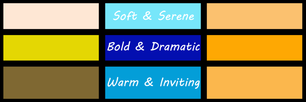
A Few Color Palette Inspirations
If you’re looking for inspiration, consider using these color palette ideas when incorporating complementary colors to blue in your artwork:
- Soft and Serene: Light blue, soft peach, and pale orange.
- Bold and Dramatic: Deep navy blue, bright tangerine, and accents of mustard yellow.
- Warm and Inviting: Sky blue, coral orange, and light brown tones for a balanced, cozy feel.
The key to using complementary colors is finding the right balance for your specific project. Whether you’re coloring a detailed nature scene, a geometric design, or a modern abstract piece, the combination of blue and orange will add interest and balance.
Elevate Your Coloring Book Art with Complementary Colors to Blue
Using complementary colors in your artwork is a powerful way to create dynamic, eye-catching designs that feel balanced and harmonious. By incorporating complementary colors to blue, such as orange, you can add energy, emotion, and depth to your coloring book pages.
Whether you’re coloring for relaxation or creating a piece of art to showcase, understanding how to use complementary colors can elevate your creative expression. If you’re ready to explore more about color theory and enhance your color palette, consider adding the Essential Color Card Deck to your collection. This card deck offers an easy and fun way to understand and apply color theory in your coloring projects.